
Don't miss out on potential customers! Learn the importance of a mobile-friendly website in 2023.
Any company looking to build an online presence in the modern world needs a website. But merely having a website is insufficient. To give visitors a better user experience, it is essential to have a mobile-friendly website given the rise in the usage of mobile devices. In this post, we'll look at the top 15 advantages of having a mobile-friendly website in 2023 and explain why it's so important for companies to use mobile-first strategies.
Top 15 benefits of a mobile-friendly website
Mobile-first approach
The number of mobile devices used to access the Internet has increased significantly, and this trend is expected to continue. Therefore, companies need to implement a mobile-first strategy to ensure that their website is mobile-friendly. A mobile-first strategy involves designing and developing a website with mobile users in mind before scaling it for larger screens such as those of desktops and laptops.

Increase in the number of mobile users
The number of mobile Internet users now exceeds that of desktop users as smartphones become more affordable and widespread. To benefit from this expanding market, companies need to ensure that their website is usable and accessible on mobile devices.
Impact on the user experience
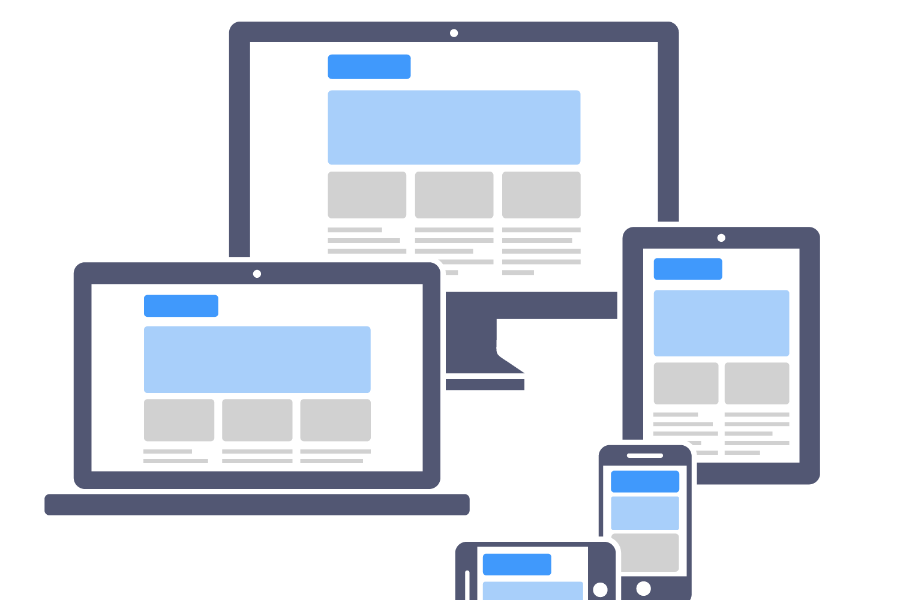
The success of a website is highly influenced by its usability. A mobile-friendly website provides users with an enhanced user experience through easy navigation, fast page loading, and adaptive design. Thanks to the adaptive design, the website adapts to the screen size of the device, making it easier to read and navigate.
Mobile SEO strategy
A mobile-friendly website is crucial not only for improving usability, but also for search engine optimization (SEO), Mobile-friendliness is considered as a ranking factor in Google's algorithm. Therefore, a mobile-friendly website can improve search engine rankings and increase organic traffic.
Higher search rankings
As mentioned above, Google also considers mobile-friendliness when determining rankings. Therefore, a mobile-friendly website can improve search engine ranking and increase both organic traffic and visibility.
Advantages of Responsive Design
The website adapts to the size of the device screen thanks to its adaptive design, making it easier to read and navigate. Users no longer have to zoom in and out, which improves the user experience. Responsive design also simplifies website management for businesses, as they only need to update one website that is suitable for all devices.
Increased engagement rates
A better user experience on a mobile-friendly website can raise engagement rates. If a website is simple to use and loads quickly, visitors are more likely to remain there and browse more. This may result in more visitors staying on the website longer and with fewer bounce rates.
Increased conversion rates
Higher conversion rates can also be achieved by having a mobile-friendly website. When a website is easy to use and provides a smooth experience, visitors are more likely to make a purchase or fill out a form. A mobile-friendly website also eliminates the need for customers to zoom in with their fingers to read content, which can be frustrating and lower conversion rates.
Faster page loading
Websites that are mobile-friendly are designed to load quickly on mobile devices. However, research shows that mobile users will abandon the site if it takes longer than three seconds to load. By ensuring that your website loads quickly and effectively on all mobile devices, you can increase user engagement and dwell time on your website.
Improved brand credibility
Trust in your brand can also be boosted by a mobile-friendly website. When users browse websites on their mobile devices, they expect a flawless experience. A website that is not mobile-friendly can give your business an outdated and unprofessional appearance. A mobile-friendly website, on the other hand, can help customers form a positive image of your business, boosting loyalty and trust.
Competitive Edge
A mobile-friendly website has become essential in the modern digital age. By investing in a custom website development, you can outperform your competitors who have not yet optimized their websites for mobile devices. Your brand will become better known and grow with a mobile-friendly website, which will allow you to reach new customers and expand your reach.
Zukunftssichere Strategie
Eine mobilfreundliche Website ist eine Investition in die Zukunft Ihres Unternehmens. Unternehmen, die ihre Websites nicht für mobile Geräte optimiert haben, könnten mit der zunehmenden Nutzung mobiler Geräte ins Hintertreffen geraten. Sie können sicherstellen, dass Ihre Website für die Zukunft gerüstet ist, unabhängig davon, wie sich die Technologie entwickelt, indem Sie jetzt in eine mobilfreundliche Website investieren.
Avoid high bounce rates
As mentioned earlier, a high bounce rate can affect the search engine ranking of your website. You can reduce bounce rates and improve your website's search engine ranking by optimizing it for mobile devices. Your business can benefit from an increase in awareness, traffic, and sales as a result.
Adapt to changing trends
In the upcoming years, it is expected that mobile usage would increase further. You can keep ahead of the curve and make sure that your company stays relevant and competitive in the future by adjusting to shifting trends and investing in a mobile-friendly website.
Accessibility for all users
A website that is optimized for mobile devices may also guarantee universal accessibility. Particularly in underdeveloped nations, consumers frequently access the internet primarily through mobile devices. You can guarantee that your website is available to all users, regardless of their device or location, by optimizing it for mobile devices.
Conclusion
In summary, having a mobile-friendly website in 2023 is not just advised, it is necessary. Mobile SEO strategy is more crucial than ever due to the increase of mobile users and the growing influence on user experience. To guarantee that visitors may access your website from any device, at any time, and on any platform, a mobile-first strategy should be developed.
Finally, having a mobile-friendly website means accessibility for all users, regardless of their device or platform. By making your website accessible to everyone, you can expand your audience and reach more potential customers.
FAQs
Why is having a website that is mobile-friendly crucial in 2023?
Since more and more people are using mobile devices, they need a flawless browsing experience. Your website will be accessible and simple to use on any device, at any time, and on any platform if it is mobile-friendly.
Why is mobile-first design so important? What does it entail?
A website is developed for mobile devices first, and then it is scaled up for bigger displays, according to the concept of mobile-first design. Given the growing number of mobile visitors, it is necessary since it guarantees that your website is optimized for the mobile experience.
How does SEO benefit from having a mobile-friendly website?
By making it simpler for search engines to scan and index your site, having a mobile-friendly website boosts SEO. Additionally, Google gives mobile-friendly websites better search ranks, which can increase your site's organic traffic. So, only hire web development expertswho provide you with mobile-friendly websites.
What advantages can responsive design offer?
In spite of the size of the device's screen, a responsive design makes sure that your website appears excellent and works properly on all of them. Additionally, it enhances user experience, lowers bounce rates, and aids with SEO.
Can a website that is optimized for mobile devices increase conversions?
Yes, having a mobile-friendly website helps increase conversions since it enhances user experience, speeds up the site, and makes it simpler for visitors to utilize and carry out desired actions.
How can I make sure my website is compatible with mobile devices?
You may use a responsive design, optimize your site performance, use readable fonts, make sure that your website is simple to browse and utilize mobile-friendly features like click-to-call and touch-friendly buttons to make sure that your website is mobile-friendly. To determine if your website is mobile-friendly, you may also utilize some online tools.
 English
  German