Whether you want to optimize a new or old website for all devices, it is necessary to know about responsive web design. So, what is responsive web design? Read this guide to get an answer. If your website is not responsive, it will not work efficiently on smaller devices, such as mobile. Additionally, this guide will explain why responsive web design is essential for enhancing websites.
Responsive web design is simply explained
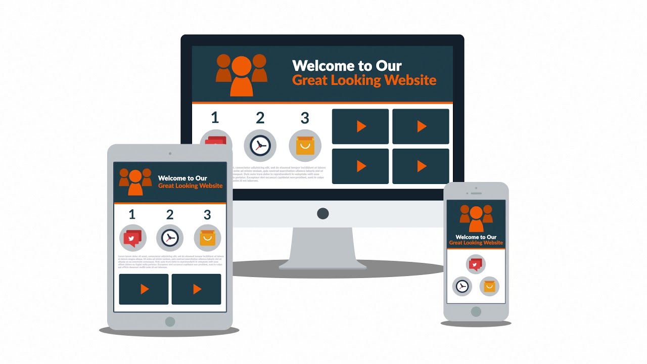
Responsive web design means optimizing the layout and elements of a website for all devices. The responsive design makes the website look good on different screen sizes and devices. Whether you are using a big laptop or a small mobile, the responsive website provides a smooth usage experience. In this way, all mobile and desktop users can easily use your website and buy your services.
What is responsive web design, and how do you create it?
Before developing a responsive website, it is essential to know what responsive design is and how to create it. Below, we have described responsive web design, its importance, and its methodology.
Why responsive web design?
Responsive web design helps your website adjust automatically to different screen sizes. The demand for responsive design is increasing due to the rising number of mobile users. For this reason, it is important to know the answer to the question, "What is responsive web design?" If you only optimize the website for desktop screens, it will appear very awkward on mobile devices. We recommend you hire a professional Web Development Agency to get a responsive website.
The importance of a mobile-first approach
The mobile-first approach means first optimizing the web for mobiles and then for large screens. Due to the advancements in the digital world, it is essential to have a mobile-friendly website. Make sure that each and every element of a website loads efficiently on smaller devices. When you optimize the website for mobile devices, you can capture the attention of multiple mobile users and increase traffic.
Utilizing CSS media queries
CSS media queries are very helpful in creating responsive web design. They help the website identify the screen size and change the layout accordingly. With the help of media queries, you can create different layouts and designs for different screen sizes. For example, you can configure the different font sizes, text styles, image dimensions, and block arrangements for different screen sizes.
Implementing a flexible grid layout
The grid layout is the arrangement of website elements in different rows and columns. Flexible grid layouts help you divide and display the website elements differently on each device. With the help of an efficient grid layout, you can make your website look great on all devices. If you have no skills in grid layout, assign this task to your digital marketing agency in Switzerland. .
Optimizing images for different devices

Large images can take up a lot of space and slow down your website, especially on mobile devices. To make your website load quickly on both desktop and mobile devices, you must optimize images. Always use a reliable tool to compress large images without compromising their visual quality. The optimized and responsive images improve the website's loading speed, which is essential for SEO.
Testing responsiveness across multiple platforms
After optimizing the layouts, text, images, and other elements, thoroughly test the website. Make sure that the website loads quickly and efficiently on all desktop and mobile devices. Test the website on all devices, screen sizes, resolutions, and browsers. This pre-testing will help you find any problems quickly and fix them before making the website live.
Responsive web design best practices
Some of the best practices for responsive web design include simple layouts, optimized images, easy-to-read text, and simple functionalities. If you are using images or other graphics on your website, optimize them to improve speed. Here are some of the best practices that will help you create a responsive website:
| Practice | Description | Benefits |
| Flexible Layouts | Use relative units like percentages for layouts | Ensures adaptability to various screen sizes |
| Responsive Images | Use media queries to control image sizes | Optimizes loading times and visual quality |
| Media Queries | Apply CSS rules based on device characteristics | Enhances user experience across devices |
| Mobile-First Approach | Design for mobile devices first, then scale up | Provides a better mobile user experience |
| Fluid Grids | Use a fluid grid system to create a flexible layout | Maintains consistency across devices |
| Viewport Meta Tag | Configure the viewport for better mobile rendering | Improves mobile display and functionality |
| Touch-Friendly Elements | Ensure buttons and links are easily tappable | Enhances usability on touch devices |
| Performance Optimization | Minimize code and resources for faster loading times | Improves overall site performance |
User-centric design principles
User-centric designs focus on the needs of users when designing the website. To make sure that the website is user-friendly, use easy navigation, readable and informative content, and a simple design. We recommend that you hire an expert web development agency in Aargau or other regions for responsive design. By following user-centric design principles, you can provide a better user experience for everyone.
Why is responsive web design essential?
After finding the answer to "What is responsive web design?" it is necessary to know about its importance. Here is a list explaining the importance of responsive web design:
. The responsive web design improves SEO performance and helps your website rank higher in search engine results.
· When your website is easy to use on mobile devices, more mobile users are likely to visit and stay on your site.
· The website, with its responsive layout and images, works effectively on all screen sizes and browsers.
· With responsive web design, your website will have a consistent usage experience on all devices.
· Using optimized images and other graphics improves the website's speed on mobile and desktop devices.
Conclusion

In short, responsive web design is essential for optimizing websites for users and search engines. Make sure that your website works well on all devices, screen sizes, and browsers. With responsive web design, your website will be ready for the future, no matter what new devices come along. Whether these are images or layouts of different interfaces, make sure that everything is consistent on all devices.
FAQs
What is responsive web design?
Responsive web design is the process of creating websites that adapt to different devices, screen sizes, and web browsers.
Why is responsive web design important?
The responsive design is important because it improves the user experience on all devices. Moreover, it also helps to increase retention rates, which is better for SEO.
How does responsive web design work?
Responsive web design uses fluid grids, flexible images, and CSS media queries to adjust the layout and content based on different screen sizes.
What are the benefits of responsive web design?
Some of the key benefits of responsive web design are improved user experience, higher search engine rankings, and consistent branding on all devices.
Is responsive web design the same as mobile-friendly design?
The main aim of both designs is to optimize the website layout on different devices. The mobile-friendly design focuses on only mobile devices, while the responsive design focuses on all devices.
 English
  German